
The purpose of this project is to demonstrate a package design concept that was creative and well thought-out. These designs were inspired synthesizing two hobbies I enjoy: rock climbing and card magic. Zion National Park has a book store that sells very similar items, but the designs have not been printed.
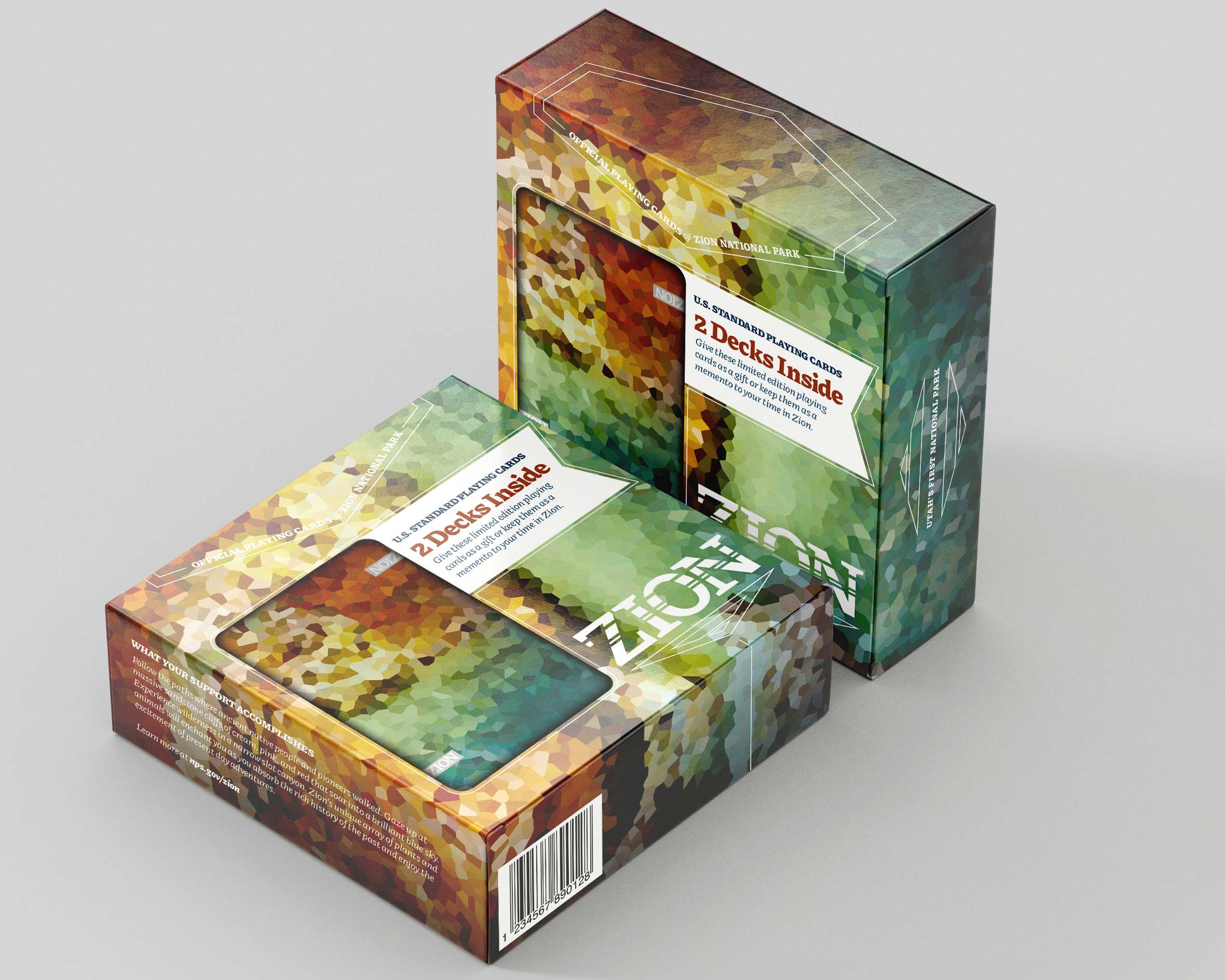
As a package set, the design scaled well to wrap the faceted colors around the entire box, showing off a wide spectrum found naturally in the park’s rock and cave features.
A cutout in the outer package allowed visitors to verify the authenticity and quality of the cards, without exposing the fully packaged decks inside. This box also allowed for longer form text to be added on the sides and back, without sacrificing negative space.
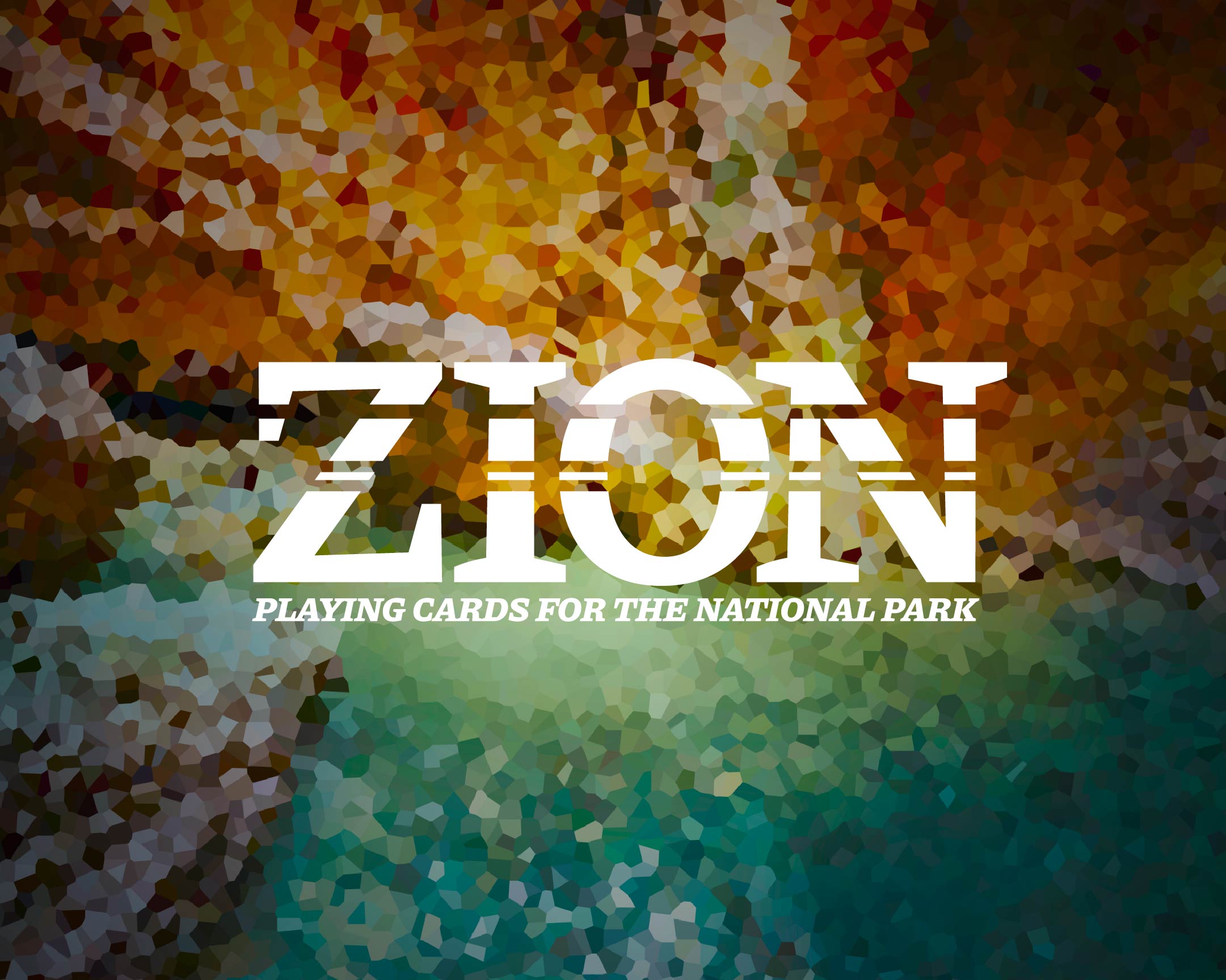
Zion National Park does not have a consistently used visual identity of their own. The Zion word mark shown here was designed specifically for this project, and nods to the layers of rock exposed from millenia of wear in the walls of the Zion's iconic canyons and formations.
The card box itself was designed to be printed with a matte base and foil stamped graphic elements.
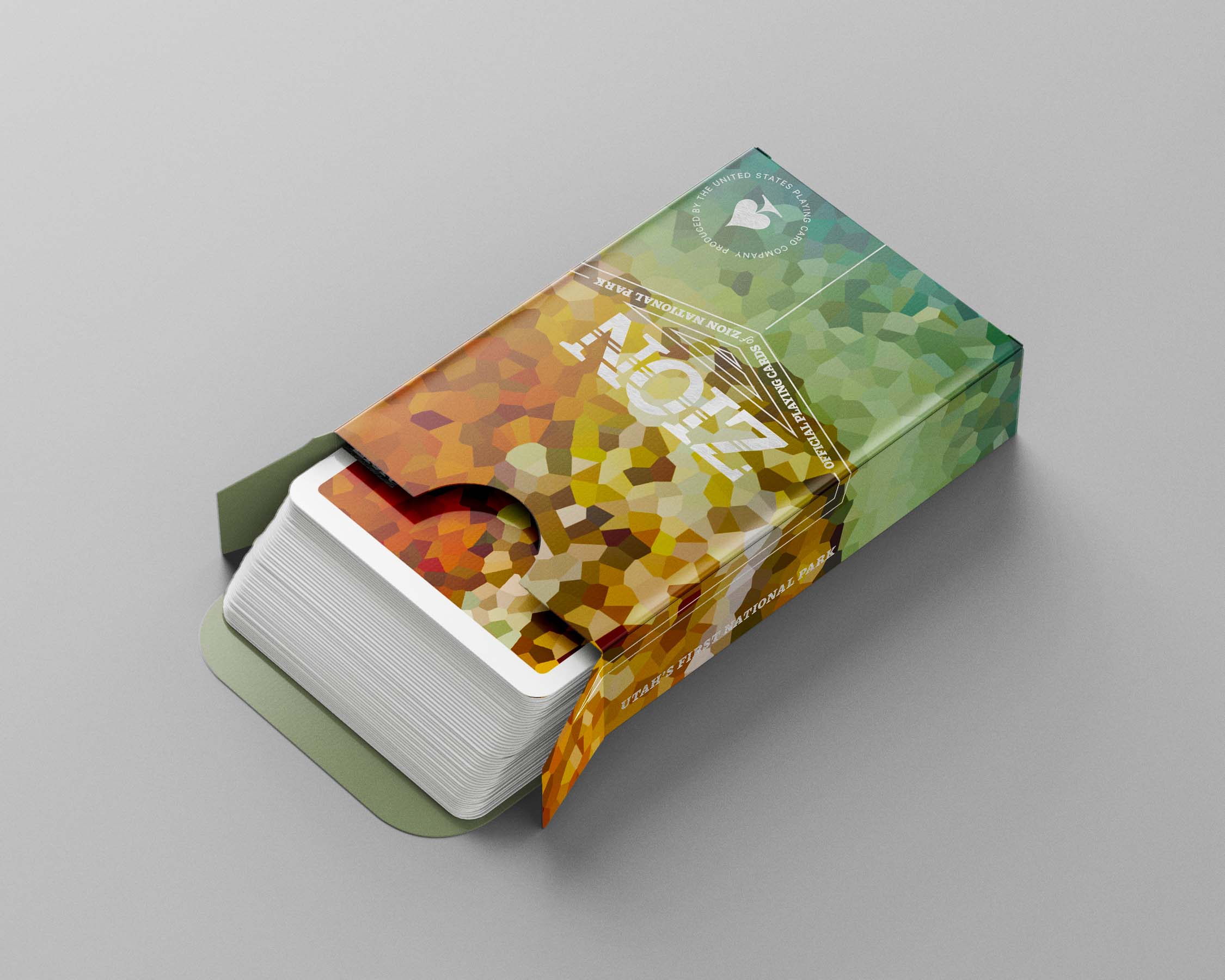
The design of the card box needed to be premium and feel like a limited edition set. To acheive this experience, I used a foil seal over the flap, and added an easter egg of the climber belaying down a cliff face to the short edge bottom panel.
While the card faces were to be kept standard, the design of the back needed to match the scale and appearance of the box without being an exact copy. The bled foil stamp of the park’s name kept a subtle branded element present without drawing too much attention.