Completed for Medical Practice
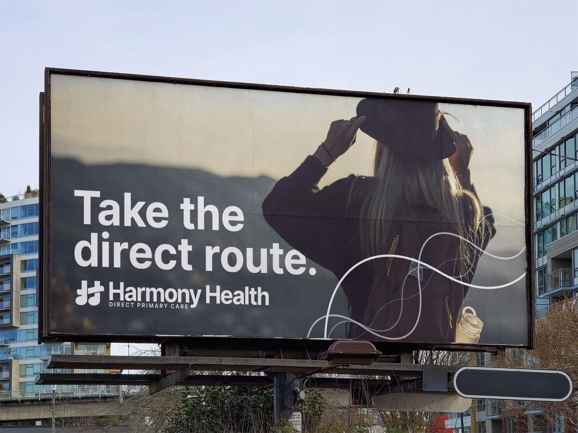
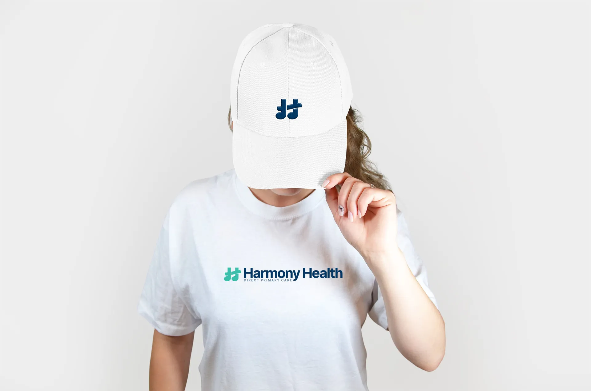
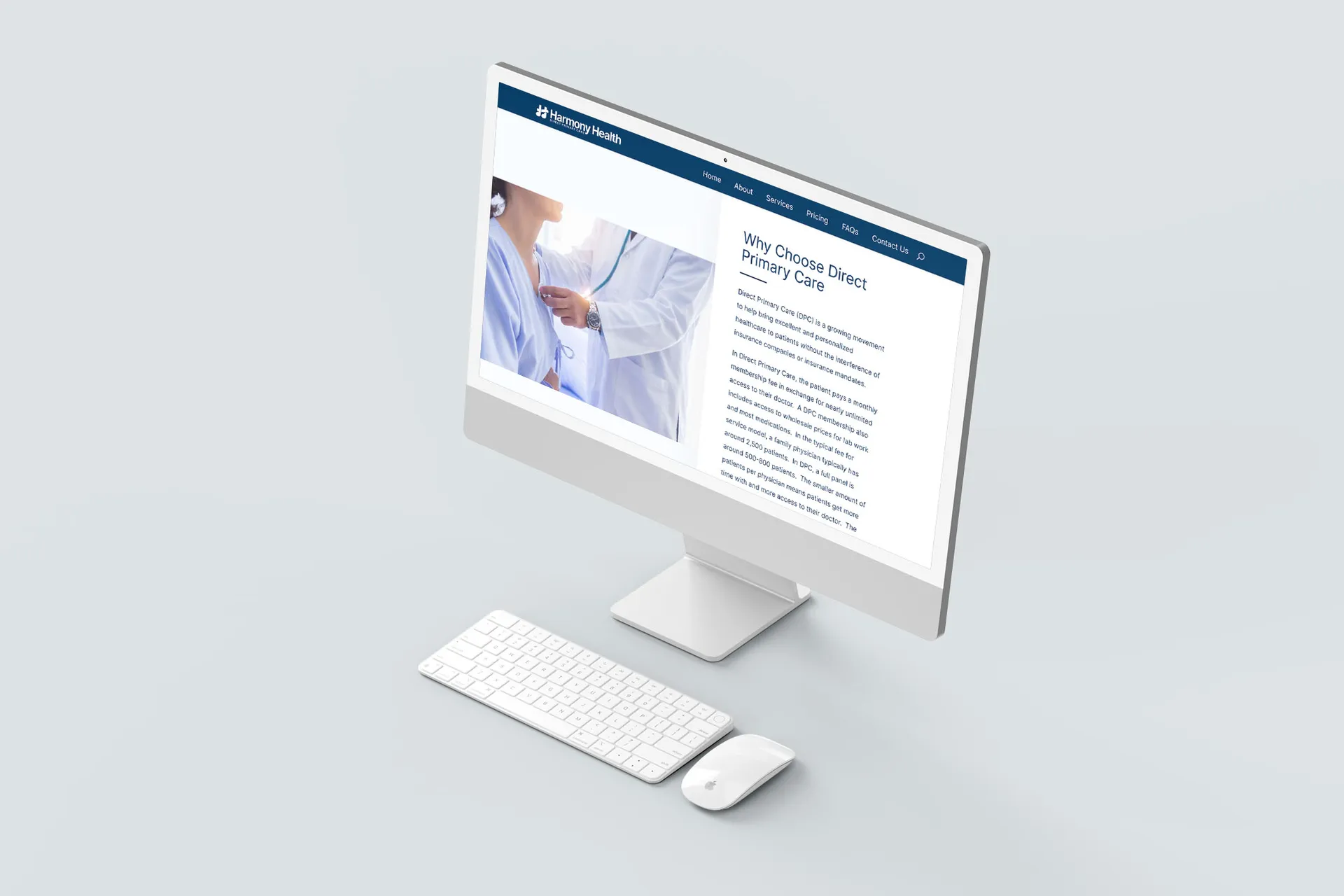
Harmony Health is a direct primary care practice in Newcastle, Oklahoma. Their brand messaging is summed up in their tagline: “Optimal health comes from harmony of body, mind, and spirit.”
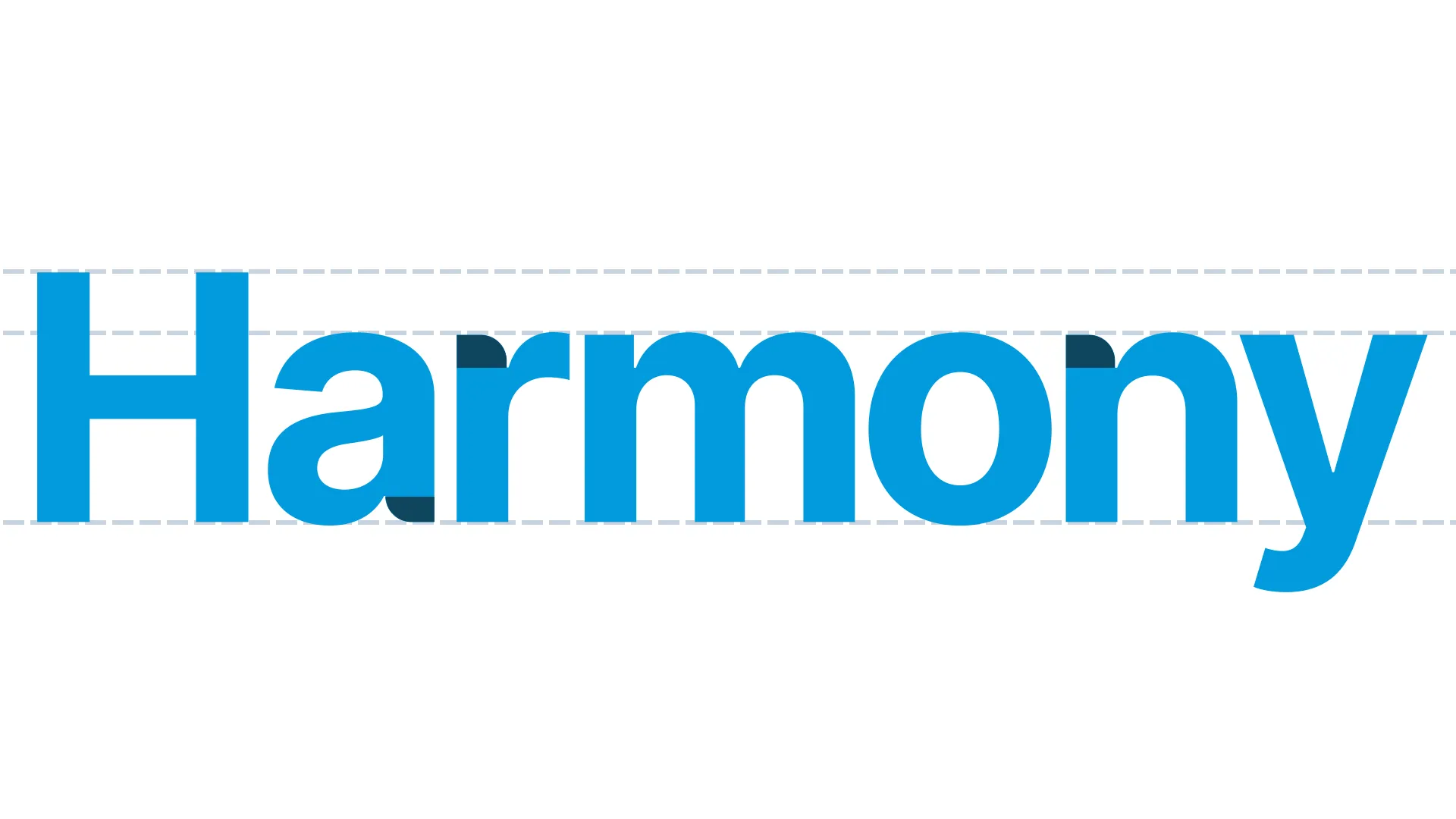
I selected Inter, a modern, trustworthy typeface befitting of this small business. Some letterforms were tweaked to make the mark slightly more approachable for moms with an affinity for natural remedies.
![]()
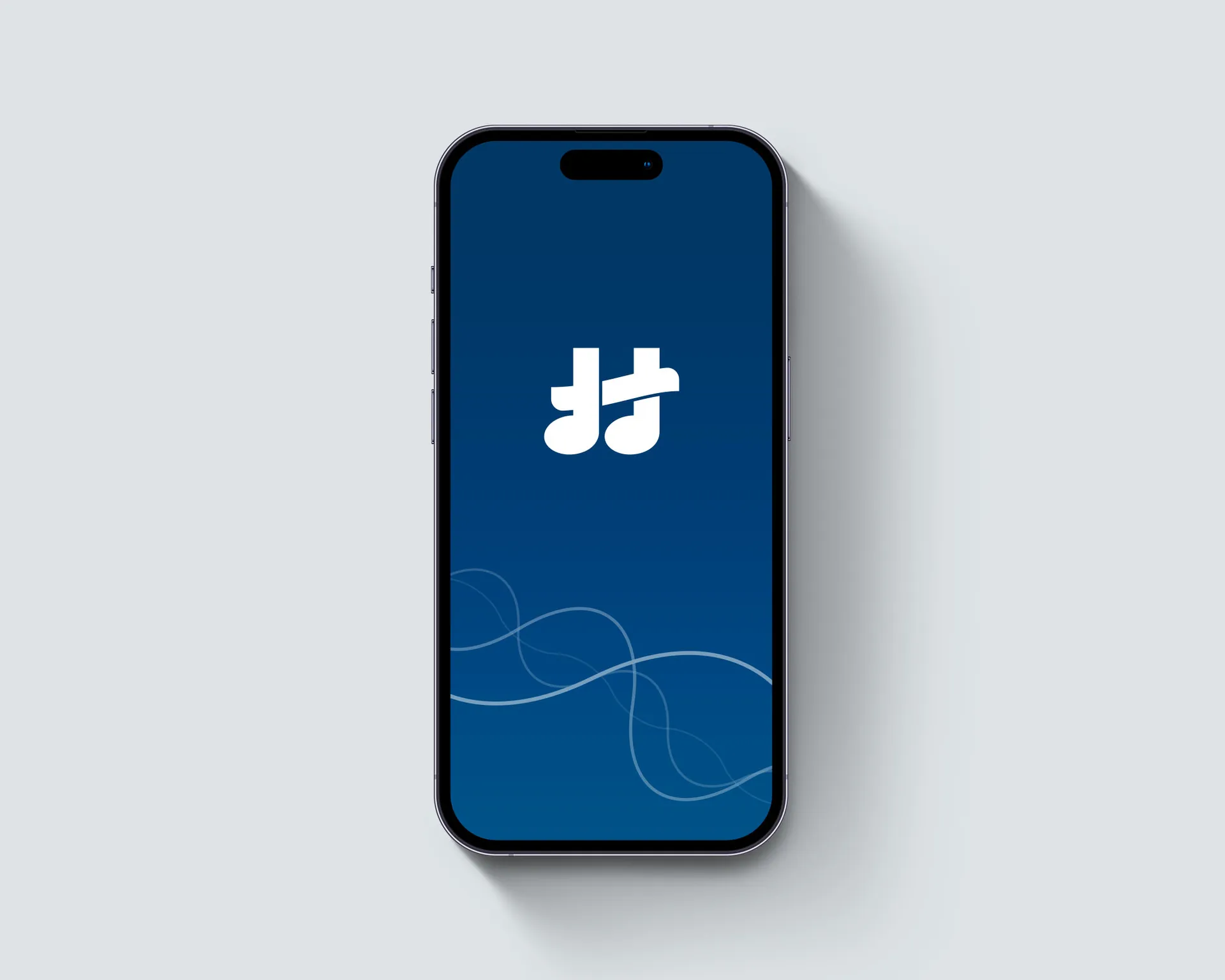
By analyzing business goals and customer demographics, I was able to arrive at a logo identity which complements the Harmony Health message. Throughout the discovery process, music and sound emerged as the dominant theme.
Although Harmony Health doesn't specialize in music therapy, the logo needed to include a musical element.
Outcome
In the end, Harmony Health, Direct Primary Care was able to successfully launch with an identity that serves well in their primarily digital contexts. The final mark is confident, bold, and balanced, showing that direct healthcare helps to harmonize every aspect of patient well-being.