With the advent of CSS logical properties, I think it's important for us to look more closely at why and how we make decisions like layout, text-alignment, and overall flow decisions for our little corners of the web.
This isn't just a history lesson, though. I want to help myself break out of the left-to-right-always-and-forever mindset that limits the creative ways I might otherwise solve layout and design problems. If you're down for that, keep reading.
Retired writing styles
Let's trace modern languages back through history a little ways. Western languages are made up of a Latin character set, which was developed from Greek, which was developed from Phoenician hieroglyphs. We could keep going back, but you probably get the idea. As written language evolved, the letters weren't the only thing that changed - the alignment, direction, and flow of information was up for experimentation as well.
Bou·stro·phe·don
Greek | "As the ox plows" 🐮
Boustrophedon writing was literally “as the ox plows.” Ancient Greeks would write one direction on a line of text, and the other direction on the next line. If there’s a word that means “as the lawn is mowed” it might also be appropriate to describe boustrophedon scripts. Here's an example of what boustrophedonic text would look like on the web:
Ron·go·ron·go
Rapanui | Easter Island Script 🗿
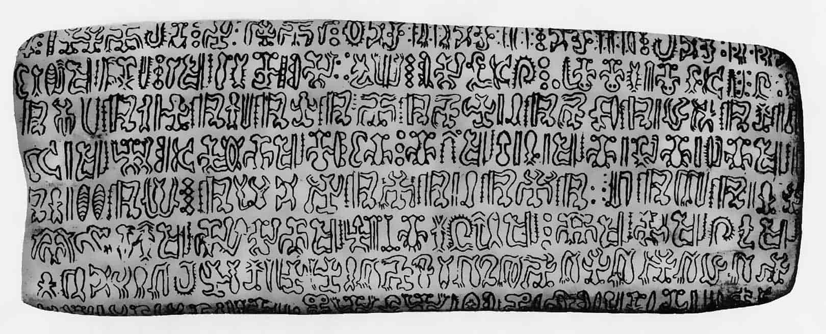
Rongorongo is a form of boustrophedonic writing that was found on Easter Island in the 1800’s. It reads left-to-right starting at the bottom line working its way up. Here's the catch: it is written upside-down on every other line, in this pattern: left-to-right right-side-up, right-to-left upside-down, and so on...
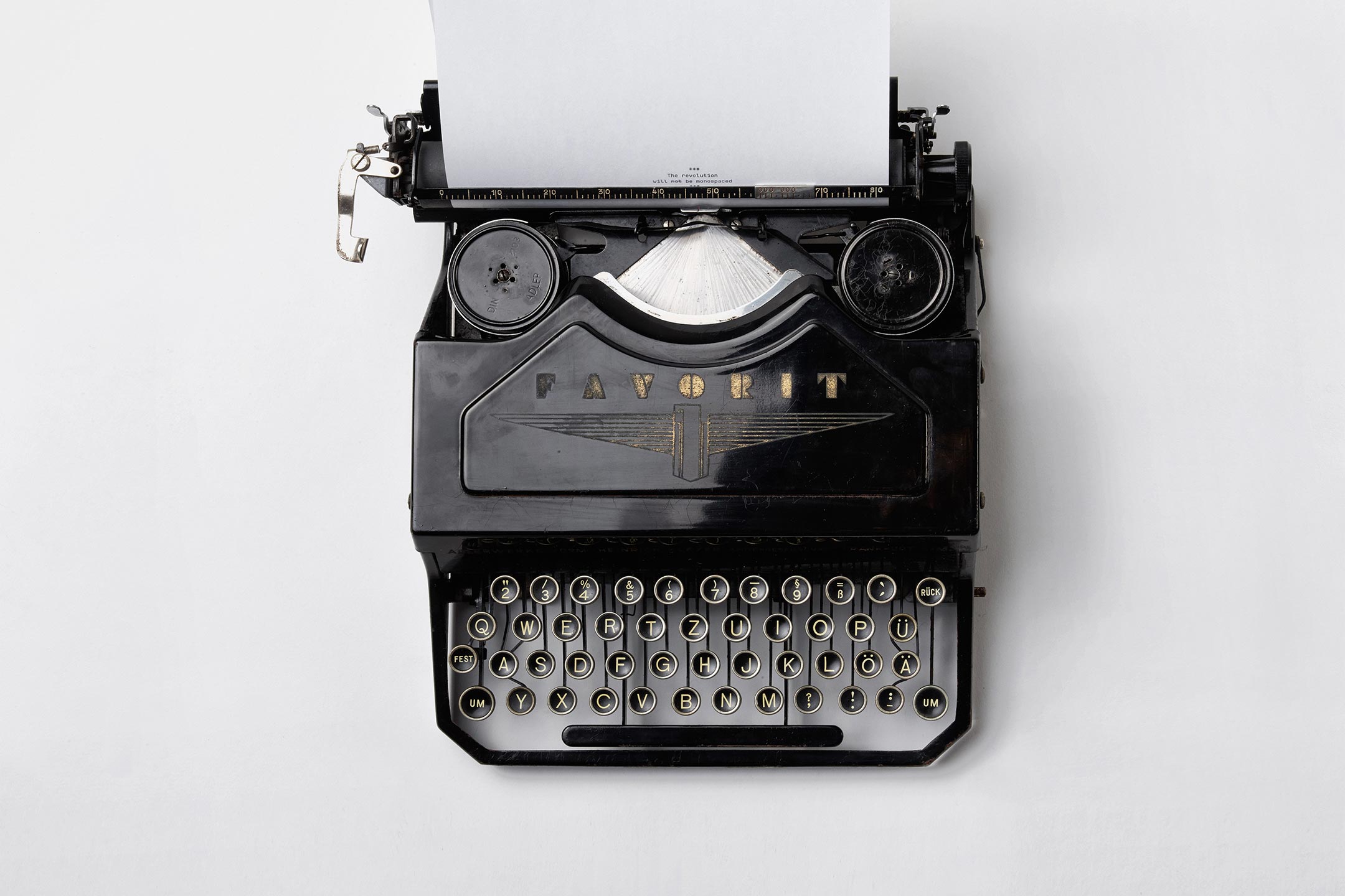
In the browser
Software performs a significant amount of math and optimization to wrap text in a way that's predictable and accounts for all edge cases.
Here's an excerpt from the Wikipedia entry on line breaking:
Line breaking, also known as word wrapping, is breaking a section of text into lines so that it will fit into the available width of a page, window or other display area. In text display, line wrap is continuing on a new line when a line is full, so that each line fits into the viewable window, allowing text to be read from top to bottom without any horizontal scrolling.
Why does it matter?
Writing/reading direction also impacts our abstraction of time into space. In other words, the way you and I might use hierarchy and flow in a design could be somewhat foreign to an East-Asian audience.
Even with English as a second language, cultures with bi-directional writing systems do spatial reasoning differently from western cultures. Progress is naturally expected to happen from bottom-to-top or left-to-right. Designing wholistically with these considerations in mind is a mountain to climb on its own.
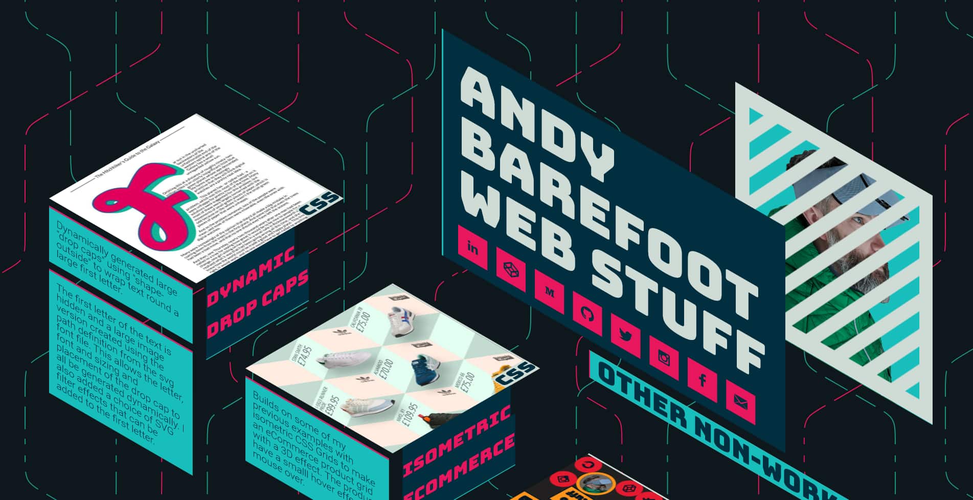
One of my favorite examples is Andy Barefoot, who specializes in eccentric layouts, and making them semantic, accessible, and user-friendly.
The web is a place where we have unlimited freedom to experiment and create. We can lay out our user interfaces in an infinite number of ways with an infinite volume of content. That kind of "see what sticks" experimentation is what led to the diverse creativity we have today, and I think we should do our best to embrace it.